Kraken emails - Content design
Redesigning the system emails experience
Kraken’s automated emails were outdated and added friction in the user journey. A full audit was needed, along with improved logic, clear & compelling content and a brand-aligned voice.
CONTEXT
Kraken is a centralized crypto exchange, operating in a complex and regulated environment.
Its system emails were outdated in terms of content and designs.
Information shared with clients was limited and often lacked clear context and next steps.
This diverted clients from their journey and added unnecessary friction.
It also harmed new product adoption and caused additional Support efforts and business costs.
MY INPUT
PROJECT STAGES
Map and audit the entire system emails inventory
Identify latest product & flow changes, to ensure new content accurately reflects them
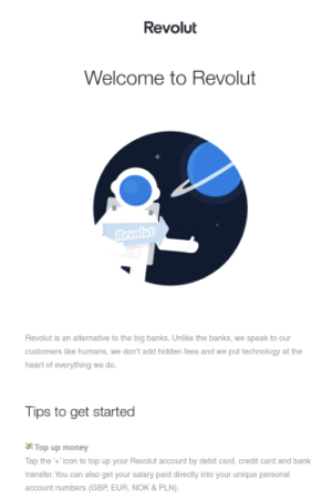
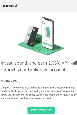
Research competitors and wider best practices
Define new email writing rules and content patterns
Create email wireframes and new copy
Collaborate with multiple stakeholders for feedback
Partner with designers, engineers and QA analysts to create the final product
PROJECT STAKEHOLDERS
To deliver this project, I teamed up closely with:
Product & Brand Design teams
Several stakeholders from across Product Management
Engineering & QA teams
Customer Experience team
Legal team
INITIAL AUDIT
At the start of the project, a few key facts were unclear:
the total number of emails in the inventory
the degree of usage (active vs retired) for existing emails
the logic governing system emails, namely the triggers or user journey moments when system emails were sent out
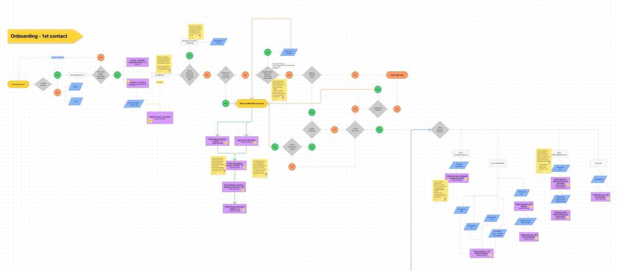
To have a clear view of the system and the clients’ experience with existing emails, I manually looked up and matched all automated emails to the client journey stages.
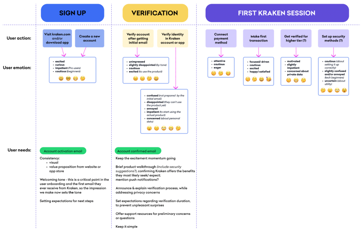
To further understand the overall experience, I also mapped out the clients’ actions, emotions and needs throughout the primary flow (onboarding). This analysis would prove critical to:
design content which responds to these expectations
ensure next steps in the clients’ journey are visible and easy
have a clearer reference when discussing with stakeholders across the company
RESEARCH
I analyzed several competitors and companies within and outside the crypto industry, focusing on:
email structure
subject line practices
design and copy layout
actionable elements
language style and voice
the balance between marketing and UX-focused copy
I also worked with the Customer Experience and UX Research teams, to learn:
common friction points for Kraken’s clients
terminology used by clients
user patterns or habits with may influence new system designs
GUIDELINES & WIREFRAMES
My audit and research work informed the new email guidelines, to be applied to all future system emails.
I defined these new guidelines focusing on 3 areas:
Design - on-brand and supporting, not outweighing content
Functionality - responsive, accessible, timely
Content - clear, guiding, actionable
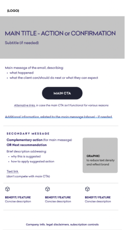
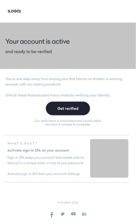
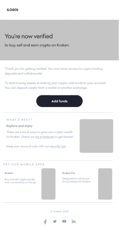
Using basic wireframes, I sketched the content structure based on the new guidelines and worked on refining it with designers.
I put special emphasis on:
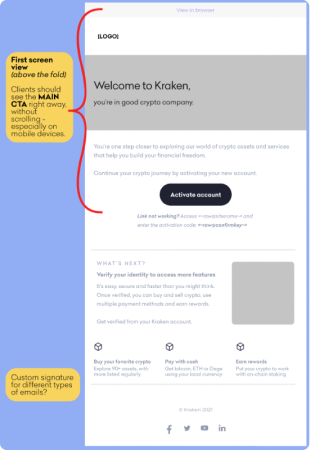
presenting the main information in the client’s first view
making actions visible and clear to clients
balancing design elements and copy
FINAL DESIGNS
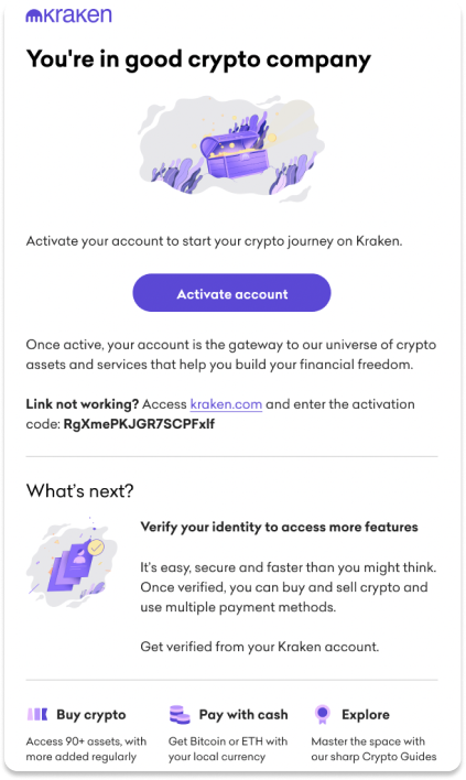
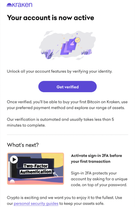
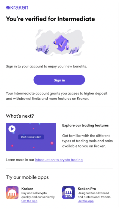
The content and design were optimized and thoroughly tested to be equally user-friendly on both desktop and mobile screens, as a key requirement based on Kraken’s user profiles.
Functional results in the first month:
Email open rate increased by 11%, primarily emails sent later in the onboarding experience
Support tickets related to client verification decreased by 5%
Product usage results in the first month:
Basic security features activation increased by 7%
Account activation and verification on mobile increased by 15% (supported by app improvements)


